How to Create an Engaging Investor Pitch Deck?
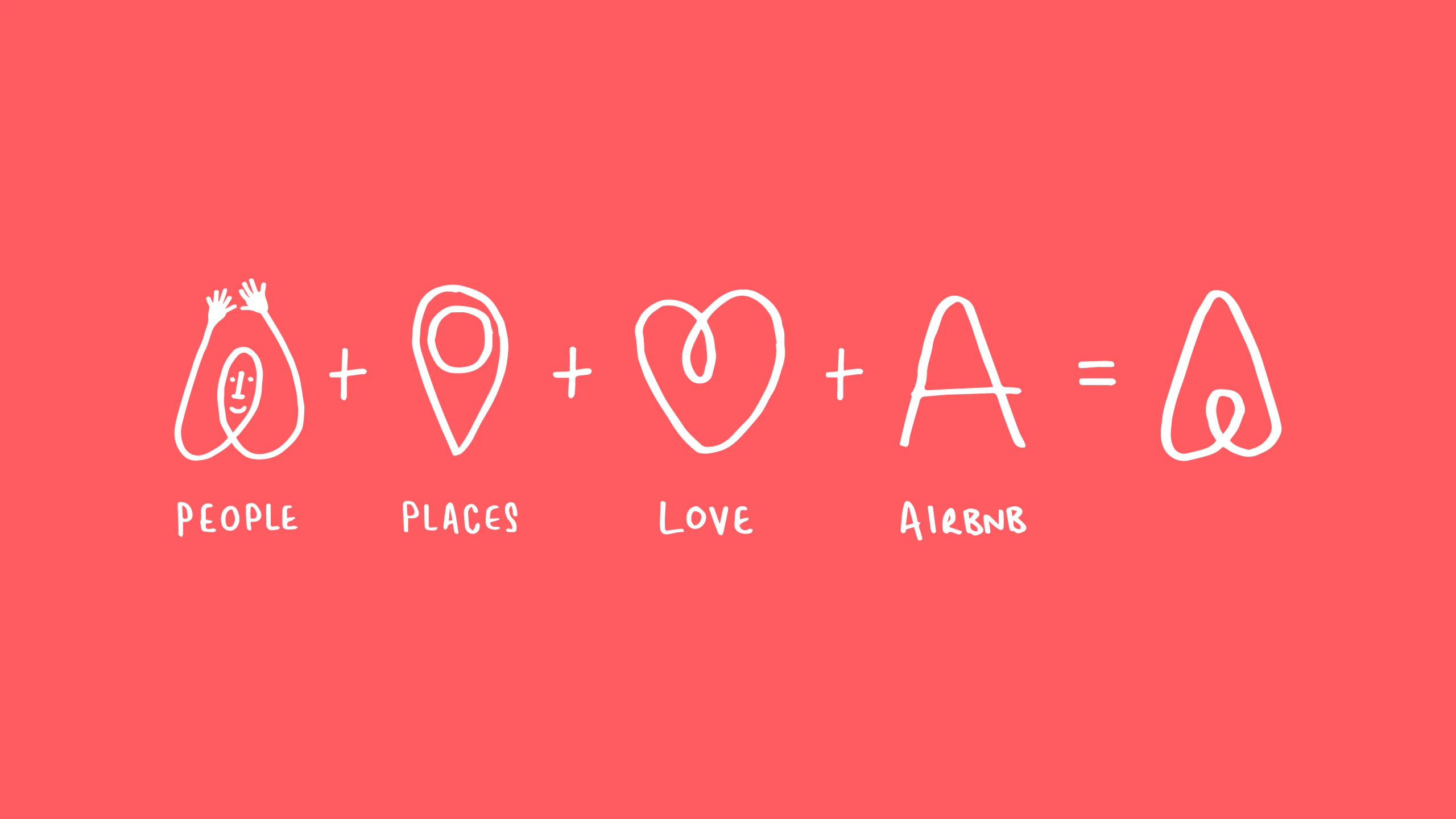
Airbnb is a great success story today, at market valuation of $30 billion. But in 2008, when Airbnb was getting started, the founders struggled for fund and they even thought of investors ridiculed their idea. When
Later on, the founders pinched their idea to an MBA student, back when they wanted it to be an air mattress rental company.
Creating an effective pitch deck or raising capital form an investor is really time consuming and difficult job. And when it comes to the importance of pitch-deck, it is crucially important for startups to get off the ground. And you will find yourself struggling especially if you are low on funds or lack design skills.
When it comes to an engaging pitch-desk, it’s not just about your slideshow skills, considering a compelling design, visually engaging slides, crisp updated content, and overall market research can be a good start.
Pitch deck narrates about your business.
Create Content and Outline Structure
Structure and content are the pillars of a successful presentations and pitch deck is a presentation. In order to create a successful pitch deck, internet can suggest you what elements should be included. Good amount of time and research is needed to study the art of fund raising for those who wants to succeed.
First, outline the structure of the pitch deck and write content for each element.
- Header
- Core message
- Explanation
Try to write the content in bullet points as it looks more structured and engaging. And once its complete, do a proof reading before taking it to another level. Try to cut down the uninformative content off the slide, it will help you bold out your message.
Design Presentation Layout and Templates
The overall design layout will change the content into tempting and engaging presentation and that’s the key to the nice and clean pitch deck. The design elements should be kept in mind while creating the templates.
- COLOR
On the 1st slide, put the logo of the company with company name and use main colors of your brand. The brand colors will reflect the message more powerfully than using those traditional old color.
- FONTS
Simple and sober fonts are more appealing and looks clean on the presentation. Those fancy fonts will surely look good but you are here for capital raising. Remember!
- SLIDE LAYOUTS
The design and placement of elements on the slide is what makes it a captivating pitch deck. The title, core message, further elaboration and footer are important. Company logo, copyright seal and page number generally come under footer section.
Sketch Your Design
- ICONS AND PICTURES
Pictures and icons are the 2 important design elements when it comes to pitch deck. Icons cover-up every aspect of life from web design to your personal navigation.
while pictures could be little bit complicated when you won’t able to find the one that looks engaging on your pitch-deck. It’s better to use instead of stock images and other natural ones that won’t go on the slides.
There are plenty of websites on the web which offers large free downloadable icons and they can be customize also according to user need. Don’t forget to include the contribution link if you are using it for free.
- CHARTS
Charts are the ideal way to play with numbers and they are more compelling and gives a broad idea about figures and why it’s important.
Also Read: Nine Presentation Lessons
- PRODUCT VISUALISATIONS AND SCREE SHOTS
Screenshots and mockups give the best message about the product with minimal description.
- TIMELINE
The best way to visualize what and when the specific event happened or scheduled is through timeline.
Sharpen Your Slides
And here are some of tips that can help your pitch deck stand out professionally.
- HIGHLIGHT TEXT
And on some slides, you definitely have some important text, make sure you emphasize that.
Give enough space between the important text after all it’s a phrase, not a sentence and use fonts size that are bigger and bold. Use accent colors to highlight the text.
- INAPPROPRIATE WHITESPACE
Take a look to the slides and identify and resolve the uneven spaces between the context.
Rearrange the text according to the need or how its goanna look engaging.
Put whitespace between the footer and the slider on slides ignoring the frame where core message is not present.
- USE FILLED BOXES AND IMAGES FOR BACKGROUND
So now, you are o the final stage in the tuning process. Years of experience of experts has shown that the proper mix of the different background (filled, image-based and plain) is for highly effective presentation.
Use 1 image per slide and filled background for every 2-3 plain slides.
Don’t go for the too plain and simple design, rather use filled/image background.
So yes, it’s done.
How its looking?
Interesting and engaging? huh!
So now I believe that this article will help you stand out the crowd with your interesting pitch-deck. Feel free to share your ideas. Leave your comments and thoughts about this guide
SOURCE: https://airbnb.design/building-a-visual-language/